Wednesday, 26 February 2014

Front cover feedback


For my final front cover I asked for feed back from people in my target audience to see what I could change or what I have done well.

Shari - the colours go well together and the angle of gaze is good on the artist

Marwa - the genre of the magazine is obvious. I like the colour scheme and the way things are arranged on the page. I also like how the angle of gaze straight away attracts the audience to the magazine.

Dawn - I think you could have chosen a better bar-code and incorporated the price  a bit better. I also think the price is a bit too low for a magazine that you are trying to sell as high standard. I like the angle of gaze and colour scheme. I also like the positioning of the image and the props used.

Nicola - I feel that it needs to be more together, the price should be either below the bar-code or in the other corner and more discrete. The colours used are very consistent and the image is very clear and attractive, it makes me want to read it.

I am happy with the feedback I received because it is both critical and appraising. For example, Nicola mentioned that the price should be more discrete, so if given the chance I would change where the price and barcode are located. I am happy that I went for this colour scheme because I have gotten positive feed back for it 

Monday, 24 February 2014

Contents page research/deconstruction

Final front cover


This is my final magazine front cover. It was created using Photoshop and I included things that would normally appear on a R&B genre music magazines. I have included a pull quotes, masthead, banner, subheadings, and bar-code and sell lines. Looking back at the steps it took me to my magazine, front cover came together really well; matching most of what I put on my final flat plan. Changing the colour scheme and text font was a decision that helped improve my magazine.

Taking away unnecessary features and adding appropriate ones helped my magazine front cover stand out more to my target audience. The purple/pink, black and white colour scheme is clearly noticeable and it is easy to see the link between the colour scheme and the lipstick.

I think that my cover links to my research in different ways, for example my main image and masthead stand out the most because that was the feedback I got from the audience. Although I didn't go with the colour scheme of red, white and black as I had intended, the purple/pink, white and black colour scheme stands out better. I found it fairly easy to find magazines that I could gain influence from. I mainly referred back to Vibe magazine front covers because they are usually really bold and eye catching; they also hold lots of conventions for an R&B magazine that I could use.

On my questionnaire I asked "what attracts you most when buying a music magazine?" - from my results it showed that my target audience focused more on the artist on the front cover; so when making my front cover I made sure that my model was centralised, took up all the space and was the main focus of the magazine. I also made sure that my model held direct angle of gaze to interact and draw the reader in. Getting my colour scheme from my model was important, so the props I chose made her stand out and were easy to make work against a background. They still kept the black and white colours which were popular in my questionnaire, so I have reached out to my target audience.

 I also asked "How much would you normally spend on a music magazine?” The majority response for this question was £0.99-£2.00, from this I made my magazine £1.50; but after looking at more music magazines I have realised that it is too low of a price. I am likely to change the price to £3.00 because it’s not too pricey, but shows that the magazine is of quality.

I am happy with my front cover and with what I have done; I am going to put pieces from it onto my contents page. I will keep the colours and font consistent.

Front cover linked to research

My magazine


This is my music magazine front cover, I have used front covers from Vibe, The source and Blender as inspiration. The research I did prior to my magazine showed that red, black and white were the most popular colours that people would like to see on a magazine, but I went against that because I felt that it didn't go with my magazine and I wanted it to be unique. I made my artist the most important thing because research showed that people buy magazines more when they see who is on the front representing it.


Vibe music covers


These two magazines are the magazines that helped influence my decisions on my front cover. 
I used these magazines for my inspiration because they are very simple but eye catching, bold and everything on the links. You can tell where they have gotten their colour scheme from, for example, Kanye West has blue on his top so the main parts of  the magazine are blue. The colours used on both of these magazines are vibrant, the masthead is constant and bold in both. Linking these two to my front cover, I have made my model the most important thing putting her in the centre. She used angle of gaze to connect with the audience and I used colours from things that she was wearing to influence the colours on my magazine. I have also used up the space on the left hand side to announce new events. Also shown on these two magazines, I have kept my colour scheme consistent, sticking to a theme of Purple/pink, white and black. I feel that I have conformed to the conventions of the usual R&B based magazine. I have used graphics, sub headings and quotes. I have added a banner which is used in both of these and I have included a bar-code. 


Sunday, 23 February 2014

Photoshop progress/ features


Here are the final transitional stages for my magazine. I started add features that would apply to my target audience. To do this I used artist names such as Drake, Jhene Aiko J.Cole and Nas. These are people associated with the R&B genre of today and appeal most to my target audience. Putting the most important things in pink/purple links them to the masthead, implying that they are important.

1. 'Beyonce's self titled album hits no.1' - I added this feature because Beyonce is a big part of today's music culture, especially for the target audience I am trying to appeal to. Having just released a new album that didn't have any promotion and was kept secret until it's release date, I feel people would be drawn to that the most, because they would like to know how she did it.

2. 'Nas and J.Cole lay down the #NewRulesOfR&B - I used a hashtag because I felt that it would appeal to the more social networking audience. I added this feature because J.cole has recently released a new album and it mentions Nas and how he let him down. That being a very spoken subject for my target audience, it will catch their eye and make them want to read the magazine.

3. The pull quote "I'm only telling my story once" is very powerful in the sense that the reader would not get another chance to hear the story, so it will draw their attention straight away. 

4. Stating that there is an exclusive interview with Jhene Aiko but not letting on any more, will keep the readers wanting more drawing them to the magazine. It also fills up the magazine making it look more full. 

5.   I wanted an issue that would promote one of the highly popular festivals that the UK holds, so I included the wireless festival. This will excite readers and have them wanting more information. 

6. 'Outkast are back' - this is the feature that is most likely to draw the readers eye the most because Outkast are a group that are associated with my target audience, but it is from when they are younger. Having it big and in bold purple highlights the fact that is an very important story

Photoshop progress

I have been working more on my magazine cover and have developed it further and have changed many things on the cover for example, the colour scheme and layout. I think that the cover is slowly coming along, however there is much more work that needs to be done in order to make the cover seem as if it is actually a music magazine cover.


1.Here I was focusing on how to enhance my picture by manipulating it's properties on Photoshop. I was playing around with the photo filter going between the warm and cooling filter. I also enhanced her eyes and made her eye liner visible.


2. Now adding lines around my front cover to make sure that all my text stays away from the edge. I also added some more text looking at vibe music magazines, to ensure that I was conforming to the genre of magazine I had chosen. I also played around with the lighting levels to try and make it look a bit darker but I didn't think it fit in well, so I left it normal.


3.I went with the lighter shade of pink and started manipulating my masthead by adding shadows and bevel and emboss which would raise each letter and make them stand out more. I also started working towards moving my text around and making sure they are the right size and font for their specific genre. 


4.Noticing that the 'Shaniya' did not look right in purple and didn't sit well at the top of the page I moved it to next to the quote and made the quote seem more fluent in font. I added some 3D effects by adjusting the layer style


Final flat plan


In my first flatplan I showed my colour scheme as being red, black and white.My artist wasn't wearing a significant jewellery or clothes and the features weren't specific to the genre.


After reading my feed back from my draft flat plan I made some major changes focusing on the image, the text and the mis-enscene. In the feedback I was told that I had too much writing going on so I
decreased the amount of text and spaced them around the page a little bit more.
I focused on the colours I was going to make the text and made that aware on my final flat plan. I took the colours from the lipstick she used. 
I showed how I wanted her to have her hair and how I wanted her to dress. I added chains, earrings and a watch. I feel all of these stuff link with the R&B genre.


While on Photoshop I did  use this flat plan to decide where everything was to be placed although some changes were made. On my final front cover more decisions were made altering what I had intended to do on my final flat plan. I moved the 'Shaniya' from the top left to the bottom left, above the quote.
I added more basic features with current affairs in the music industry. I placed the pull quote in the centre of her because I wanted it to stand out.


I also asked for some feedback from some of my peers.

Nicola - I liked the way you took my advice and you took away some of the things I mentioned. I looks clearer and is easier to identify where things are.

Dawn - You have clearly stated where you want everything to go and the image is highly detailed. I feel like you should have identified the fonts that you were going to use

Shari - I like the positioning of the banner and the fact that you have added relevant features.

From this feed back, If I get the chance to update anything I will make a new flat plan identifying the font.

Photoshop

Once I had taken all of my photos, I started to create my front cover on Photoshop. At first my colour scheme was red, black and white; as I went on to gain some feed back from my peers and teacher, I realized that the colours I had chosen would not work as well with my image and layout.

Looking at my flat plan and ensuring that I lay everything out as I had planned to, I started working on my banner. Focusing on this would  help determine where to place the masthead and how much room I would need for the rest of the text. I next went to working on the masthead. I acquired the font 'old school-united shadow' off of da'font and went on to changing the colour. I started off by using the magnetic lasso tool to carefully cut each letter out and then placing them on different layers, I used the paint bucket to change the colour. The masthead was going to be red but it didn't look right, so I then used the colour sample tool to take the colour from her lips. As I went on I started to add text and quotes to make my magazine feel real. I added a quote from my artist and started to play around with colours on the text using the colour sample tool. Here I decided to change the colour of my masthead and banner to purple, this was chosen from her lipstick.


Sunday, 16 February 2014

Front cover final shots

These are the final shot pictures, from these I will select one for my magazine front cover.  They were taken in my schools photography room, where there are different lights I can manipulate. For my front cover I wanted my model to portray the role of an R&B artist, so I got her to wear jewellery associated with the genre and pose in various ways. 
 This first picture was taken whilst I was on a chair, whilst she was looking straight at the camera. I took a medium close up so I could capture all the details of the props, whilst focusing focusing on her face.
This second picture is a mid-shot. It was taken mainly to focus on the portrayal of the R&B artist she pretending to be. Her hands are onto the chain but at the same time showing us her watch. This is common in normal R&B magazine because they like to show off what they have.

The third and forth picture are medium close ups . In all the pictures I asked the model to look at the camera to portray direct angle of gaze because I know that it will draw the audience in. With the third picture I turned the flash on to make the picture darker because I wanted to see how the manipulation of light would make the picture look different. 
For the fifth and sixth picture they are both mid-shots and were taken from further away. The fifth picture was taken with me kneeling on the floor because I wanted to show superiority in my model. The sixth picture was taken with me standing on a chair and looking down on my model.

I asked my peers which picture would look best on my magazine front cover and they chose the fourth one, so that is what I have gone with.  They chose it because of the way the light captures her face, they are no shadows and it portrays the genre of R&B. When on photoshop I will be manipulating the light and features of my model, to enhance the image. 

Wednesday, 5 February 2014

Font testing


I got some feed back from three of my peers that have given me feed back before. They looked at each of the font types I considered and told me the one they would most like to see.

Nicola - I like all of fonts and I really feel like they go with the R&B genre you're looking for.

Shari - They look like something that you could find on a vibe magazine, very simple and bold. I think they would all loo really good on your magazine

Dawn- I don't like the serif writing because I feel like they don't go well with a R&B magazine

After looking at my feed back I was able to make a decision for the font I was going to use. I chose the font style 'old_school_united_shadow'. I chose it because I feel like it fits in with the genre I have chosen and would be easy to manipulate on Photoshop. I chose the top one because I felt that the slant took up more space and made it look better.


Sample Shots


Sample shots

Taking sample shots allowed me to see where I had to position the light to get rid of any shadows; how I would tell my model to pose and see what kind of shots worked best. The pictures were taken on a professional camera, in my schools photography room. Here my model is holding onto her lanyard but in the real pictures she will be holding onto a gold chain and dressed in black.

Artist Profile

Monday, 3 February 2014

Flat plan feed back

I asked my target audience to give me feedback on my front cover, contents page and double page spread. The students I asked were Stacey, Dawn and Nicola; these are students that took my questionnaire when i sent it out. 


Sunday, 2 February 2014

Shot types


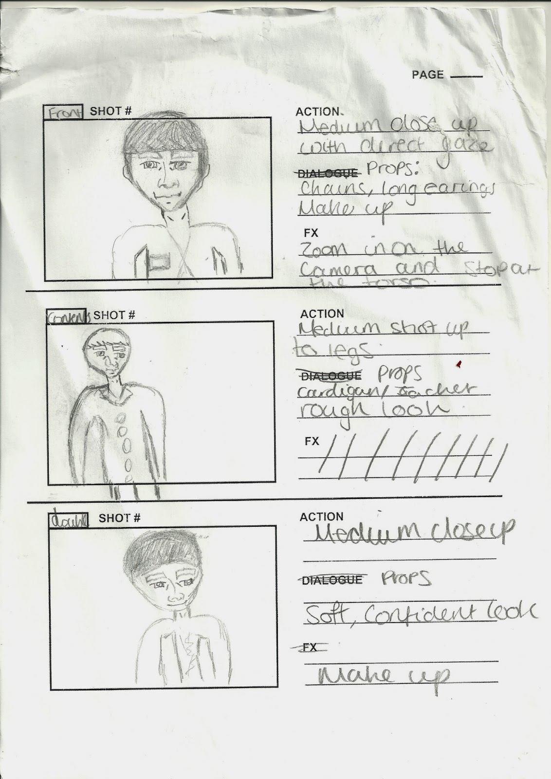
I have identified the type of shots I am planning to use for each of my pages. I plan on having props such as chains, crowns, earrings and other things that conform the stereotypes of R&B. My first shot is going to be a medium close up of my artist, focusing mainly on what they are wearing. My second shot is going to be a medium shot to try and capture as much of them as I can for the contents page. My lat shot may have more than one image, ranging from a medium close up to a long shot. When using Photoshop I will edit the pictures adding lighting effects in certain areas.


Draft flat plan

Visual magazine profile

Visual magazine profile

Deconstruction of genre magazine

Double page spread