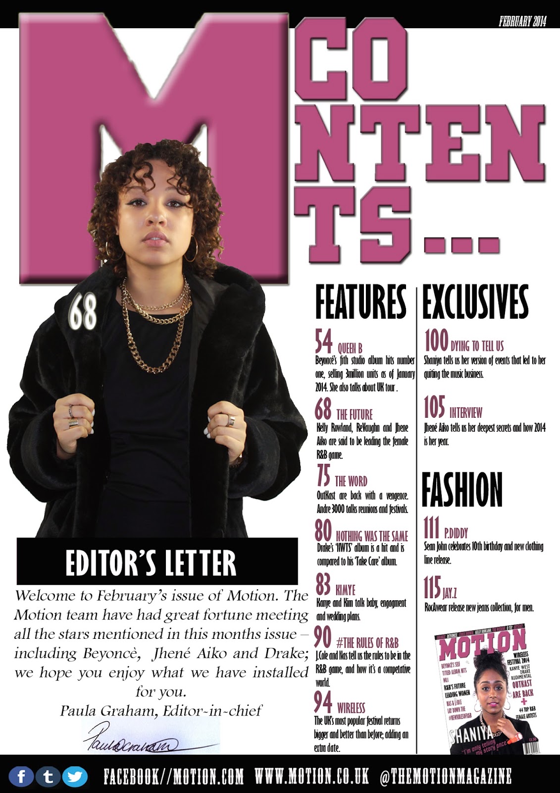
Marwa - contents page was well thought through as the colours also match to make the magazine seem more professional. I especially like the use of your main image , which makes it seem more official and realistic.
Nicola - contents page is clear to understand and nice clear image that is eye catching I like the font used and it’s consistent
Shari - I like the layout and the fact that you have used up all the space. I feel that your editors note should be smaller and your image bigger to state ensure that your audience know, that is the most important thing.
Dawn - I really like how the contents page was kept consistent to the front cover; keeping the colour scheme and features the same. Your image clealy represent your genre and everything is of reasonable size.
No comments:
Post a Comment